Questions and Answers About Luminosity Masks
©2010 Tony Kuyper
Below are some questions that I've received regarding using the luminosity masks. I thought it might be instructive to list these, along with the answers, as a way to assist others to improve their skill level with these techniques. Clicking on a question will jump the answer.
#2 How do I decide which luminosity mask to use?
#5 What workflow do you recommend when using the masks?
Question #1: The entire image seems to be affected when I do an adjustment with one of the luminosity masks on a Curves adjustment layer, not just the tones I want to adjust. Why is this?
What you're actually seeing is the self-feathering effect of the masks. When you look at a luminosity mask, the white areas in the mask are the ones that will be adjusted most, but any area of the mask that isn't 100% black, i.e. some shade of gray, could also be partially adjusted when the curve on the Curves adjustment layer is bent. Gray areas of the mask correspond to partially selected pixels, which can be partially adjusted when adjusting the intended tones. These partially selected/partially adjusted pixels are what makes the adjustment blend so well into the image. So, the Lights mask, in addition to correctly selecting the light values in the image, also has an abundance of gray tones, and therefore bleeds significantly into the darker tones as it blends the adjustment into the rest of the image.
The best way to handle this situation of inadvertently adjusting the wrong tones is to choose a more restrictive mask (see question #2 below for information on which mask to use). For example, if adjusting through the Lights (Lights-1) mask affects the darker tones too much, try the Light Lights (Lights-2) or Bright Lights (Lights-3) or even the Super Lights (Lights-4) as an alternative. These masks progressively prevent more and more dark tones from being included in the tones that get adjusted or feathered as part of the overall adjustment but are still feathering, but over a more narrow range of tones.
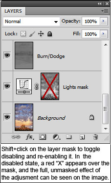
As a reminder, a mask will always hold back or mitigate the full adjustment from being transferred to the image. So even though it may look as if the adjustment is affecting the entire image, disabling the mask on the adjustment layer will show that the adjustment is much more pronounced and tone-specific than without the mask. You can see this by doing a Shift+click on the mask to disable it. When the red "X" appears over the mask, the full, unmasked adjustment will be visible on the image. Shift+click on the mask again to re-enable it.
Another option for confining the adjustment to specific areas of the image is to use luminosity painting instead of a luminosity mask on an adjustment layer. Luminosity painting allows brushing the adjustment precisely where it's needed in the image.
Question #2: How do I decide which luminosity mask to use?
Deciding which luminosity mask to use has gotten much easier as the TKActions panel for making masks has improved. It now has a mask-based interface, which means that you can see the actual mask as it's generated and modified. Basically, the correct strategy for choosing masks is to find or create one that is lightest/whitest in areas of the image that need to be selected or adjusted, and darkest/blackest in areas that should not be selected or adjusted. Just remember that for masks, white reveals and black conceals. The lightest/whites parts of the mask will be the parts of the image targeted by that mask. Gray areas of the mask are partially targeted and provide for the good blending that naturally comes with using luminosity masks. Very dark and black area of the mask shield that part of the image from being affected by whatever happens using the mask. A typlical Lights-series luminosity mask is shown below. This mask could be useful for targeting the lighter areas of the sky and rainbow.

Question #3: I see in your examples that you mostly use Curves adjustment layers when using the luminosity masks. Why not use Levels?
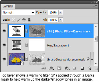
Actually, it's fine to use whichever type of adjustment layer works best. There are many ways to reach the same end in Photoshop, and many times it comes down to personal preference. I use Curves a lot and feel comfortable with this type of adjustment so it's the one I often choose. However, I have also used the luminosity masks with Levels, Selective Color, Photo Filter, and Brightness/Contrast adjustments. It all depends on what the image needs and how I want to accomplish my adjustment goals. It's actually important to NOT feel restricted to using a specific type of adjustment layer with the masks. The mask is simply a selection of a specific tonal range. How you adjust that particular tonal range is completely up to you. Over time you'll probably find several different types of adjustment layers that work well with the masks. I've found that the Photo Filter in combination with a luminosity mask, for example, works particularly well to add tint to just the light or dark areas of the image like in the figure below. Over the years I've continued to add more and more output options for the masks generated by the TKActions panel. There are now lots of different adjustment layers and even some pixel layers. The masks work on many different types of layers, and the panel makes these easily accessible.
Question #4: It seems like luminosity painting can do the same thing as using the luminosity masks on Curves adjustment layers—adjusting the brightness and contrast of specific tones in the image. Is there an advantage of choosing one method over the other?
It's going to depend on what you want to accomplish with a particular adjustment, but yes, there are some significant differences in these two methods of doing tonal adjustments to the image.
If you're looking to make more global adjustments to all the similar tones in an image, then using a luminosity mask on an adjustment layer is the best way to go. It's very quick, for example, to make a Curves adjustment layer, bend the curve, and make significant changes to the desired tones across the entire image.
Luminosity painting is a little more time-consuming, but it offers several possible advantages. The first is the ability to localize the adjustment to a specific part of the image. Only those pixels in the active selection under the brush stroke are affected by the paint. So instead of adjusting all the similar tones as with a masked Curves adjustment, painting only adjusts those tones and areas that get painted.
Additionally, you can repeatedly brush an area on the Burn/Dodge layer during luminosity painting to build up the tonal change through the active selection. Applying more paint increases the effect. Even if you're brushing with 100% opacity, the mask usually won't allow 100% paint to be deposited on the Burn/Dodge layer. So repeated brush strokes continue to add paint to the Burn/Dodge layer to enhance the effect. In some parts of the image you might need only one brush stroke to make the adjustment. Other parts two strokes. Some parts ten. It all depends on how the image is looking to you. This variable amount of brushing means a particular luminosity selection can be applied differently to different areas of the image depending on how many brush strokes you make. So instead of getting a global effect from one luminosity mask on a Curves adjustment layer, luminosity painting can create a highly varied effect across the image depending on how much paint is applied through the selection.
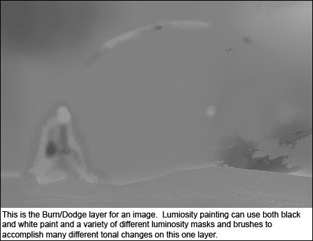
A third advantage of luminosity painting is that you can change the mask selection you paint through at any time to target different tones and you can also change the paint color to get a different effect, and this can all be done on one layer. You can lighten some tones or areas by painting white through one mask and darken other tones or areas by painting black through a different mask. In this way, the Burn/Dodge layer can take the place of multiple Curves adjustment layers. Instead of making several Curves adjustment layers with different masks, you can just luminosity paint through the different masks onto one Burn/Dodge layer. The figure below is a Burn/Dodge layer with multiple brush storkes with black and white paint through different luminosity masks.
Some additional advantages of luminosity painting include added feathering of the adjustment from painting with a feathered brush and the ability to reverse or fine-tune an adjustment by switching to the opposite color paint.
To some degree, using luminosity masks on adjustment layers and luminosity painting, even though they sometimes address similar issues in an image, can almost be thought of as different techniques. Masked adjustment layers are a great way to make global changes to all similar tones in an image, and can be used with different types of adjustment layers to adjust brightness and contrast as well as color and saturation (see Question #3). Luminosity painting is almost exclusively used to adjust brightness and contrast, and is an incredibly powerful way to use one canvas (the Burn/Dodge layer) for affecting a variety of different tonal changes to specific areas of an image. In many images, both techniques will be useful.
Question #5: What workflow do you recommend when using the masks?
The first thing I will say about workflow is that every image, especially in nature photography, is its own creation and will require its own approach. No two images are the same. The sequence of steps to develop an image in Photoshop changes with each image and also as each image develops. The important thing is to be able figure out what the image needs and then to find a way to respond to that need. So it's difficult, perhaps even impossible, to provide a step-by-step approach to developing an image using the masks. However, I'll provide some general concepts that I have found useful.
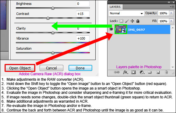
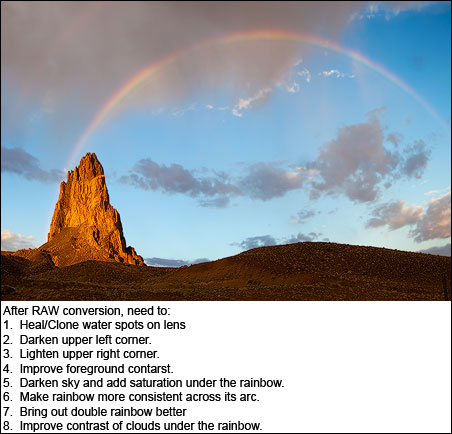
- Get the best possible image from the RAW converter (I use Adobe Camera Raw), but be careful to not overdo things at this stage. For me, this means making adjustments to white balance, brightness/exposure, contrast, and vibrance (I rarely use the saturation slider), and correcting chromatic aberration, all the time keeping an eye on the histogram to prevent clipping at either end. After making the initial adjustments to the RAW file, I open the image as an object in Photoshop by holding down the Shift key which toggles the Open Image button to an Open Object button. Once the image/object is in Photoshop I can double-click the thumbnail image on the smart object layer to reopen the image in the RAW converter to do a bit more tweaking anytime I feel it's need. The goal is to have a decent image from the RAW convertor but not necessarily a finished image. The fine control that Photoshop offers is hard to achieve in the RAW converter, but the RAW converter is indispensible for shaping an image into its initial form.
- Study your image and figure out what is needed to improve it. This is not necessarily easy. Sometimes it's hard to know what isn't quite right with the image, but it's important to work to develop this skill, and it does improve with practice. Think in terms of color, brightness and contrast, and saturation. Think about trying to achieve the proper balance of these across the entire frame and in the right proportion for the different elements in the image. Look for even small things that could be improved. While perception is vital when taking the picture, it's equally critical when developing it. Be looking hard for ways to improve the image in Photoshop just like you were looking hard for the right composition when you clicked the shutter.
- Make the improvements. This can be hard too, but masks and painting can be very helpful in isolating adjustments to just those areas that need it. Having the right tools and developing good technique means that when you see something to improve in your image, you'll have the means to do it. Make the global changes as they're needed, but don't neglect the small areas either. There really are no unimportant pixels. Everything needs to look right. When adjusting the image, work incrementally. Identify and solve one problem at a time. Sometimes the changes can be quite dramatic, other times very subtle. Much of the heavy-lifting in terms the major adjustments to the image may have already been done in the RAW converter. So maybe there are only small changes that need to be made in Photoshop, but work through these to get the image looking its best. It may take several layers and the effects may add up slowly, but it's this iterative process of evaluation and improvement that will impart your personal touch in the end. The good news is that if the RAW conversion wasn't too severe, the pixels are actually more plastic than one might imagine. So when using pixel-based masks, like luminosity masks, there is usually quite a bit of leeway before pixels start looking totally wrong. Don't be afraid to get a little aggressive in your efforts to improve the image. The self-feathering character of the masks insures that even big changes to the image can still blend in and look completely natural.
- Proof. I have friends who tell me that they can do all their proofing in Light Room or Photoshop and are satisfied with the results. My experience is quite the opposite. I need to take the image out of Photoshop and see it in a different setting in order to figure out the best way to adjust it. This always helps with my critical evaluation and guides further development. I always end up making a series of actual prints to get the image right. I don't know why, but a hard copy of the picture communicates much better than a monitor where the image needs to go. Six prints is probably about the average number I make until I'm satisfied with the results, and without fail, each iteration provides valuable instruction on what I need to do next. A profiled monitor and custom print profiles are essential in this process, as is a reasonably good understanding of how to use Photoshop's print dialog box. However, since prints are so valuable in improving an image, the investment of time and money to be able to make calibrated prints is, I feel, an important factor in an effective workflow.