Luminosity Painting
©2008 Tony Kuyper
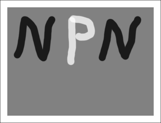
NOTE: This tutorial builds on the concepts and techniques first discussed in the Luminosity Masks tutorial. Familiarity with the different types of luminosity masks discussed there and a basic knowledge of how the different masks are created and how they function will be important to understanding luminosity painting. If you've not read that tutorial, please visit the highlighted link for more information. Also, this tutorial was originally developed for publication on NaturePhotographers.net, an online forum for nature photographers. When "NPN" is mentioned in this tutorial it is referring to that website.
The Burn/Dodge Layer
Luminosity painting is a convenient and controllable method to adjust brightness and contrast by painting on a layer in Photoshop. As its name implies, it uses the luminosity masks discussed in the Luminosity Masks tutorial to achieve its end result.
The painting occurs on a pixel-containing layer, which is a relatively straightforward process in Photoshop. The pixel-containing layer is called a Burn/Dodge layer. It's created in the following manner:
- Create a new, empty layer as the topmost layer in the layer stack (Shift-Alt-Ctrl+N).
- Change the blending mode at the top of the Layers palette to Soft Light.
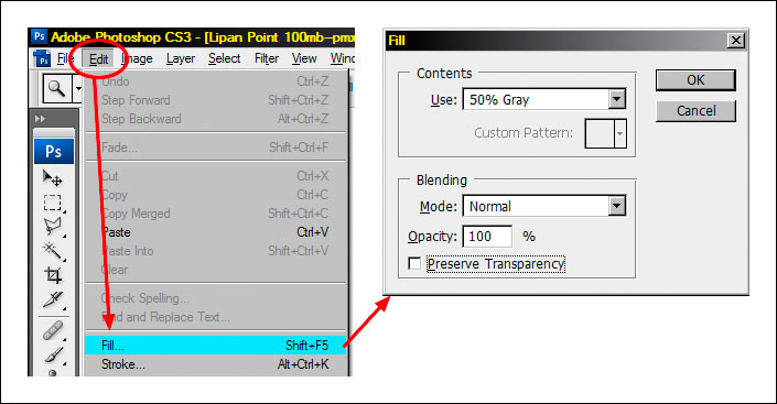
- Fill the layer with 50% gray (Edit > Fill > Use: 50% Gray, Mode: Normal, Opacity: 100%) as shown in the figure below.
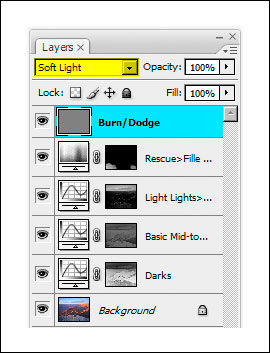
- Rename the layer "Burn/Dodge."
When finished, the Burn/Dodge layer should resemble the top layer in the figure below.
How to Use the Burn/Dodge Layer
Soft Light mode darkens or lightens the color below it in proportion to how much darker or lighter the color is than 50% gray. The fill color of 50% gray is totally neutral. It neither lightens nor darkens the colors below it, so when the layer is filled with 50% gray, it has no effect on how the image looks. Painting black or white on this layer, however, will have an effect. White is lighter than 50% gray, so anything beneath the white paint will be lightened. In the darkroom, this procedure is called "dodging." Painting black on the Burn/Dodge layer causes all colors below the paint to darken. This is called "burning." So simply painting white and black on the Burn/Dodge layer allows brightness or darkness to be painted into specific areas of the image.
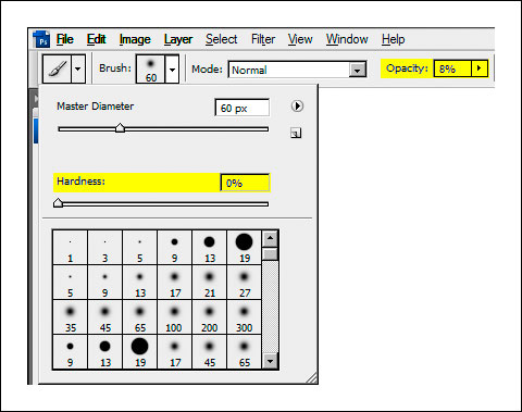
When burning and dodging by painting on a Burn/Dodge layer, a feathered brush is generally used with the brush size scaled appropriately for the area being painted. The brush's opacity is usually set to less than 10% (figure below). Even small amounts of paint applied to the Burn/Dodge layer can produce significant changes, so using a low-opacity brush insures that it's not carried too far too fast. It's ideal to make several passes with the brush to slowly build up the effect. If burning or dodging does go too far, simply use the opposite color to paint over the area. This moves the color back toward 50% grays and reverses the effect.
To get a sense for how the Burn/Dodge layer works, simply take a few swipes with a high-opacity brush and observe the effect on the image. The image below shows a Burn/Dodge layer that has had a few strokes with a 75%-opacity brush using black and white paint.
The effect on this layer in Soft Light blending mode is shown in the image below. The white paint clearly lightens (dodges) the image and the dark paint darkens (burns) it. Because the layer is in Soft Light blending mode, all the details in the image can still be seen through the paint, just the brightness of the underlying pixels is changed. By using a lower opacity brush and choosing the correct brush size, burning and dodging can be achieved in a gentler and highly controllable manner.

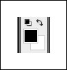
When burning and dodging an image in Photoshop, it's helpful to use the "D" and "X" keys. Typing "D" resets the foreground and background colors to their defaults for pixel-containing layers—black foreground and white background. The figure below shows how it looks on Photoshop's Tool bar. The foreground color is the color used for painting. Resetting the colors before painting on the Burn/Dodge layer is a good idea to insure that painting doesn't occur with a colored brush, which can change the color of the image.
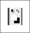
Typing "X" reverses the foreground and background colors (figure below). Often, when working on the Burn/Dodge layer, there is a need to flip back and forth between burning and dodging. The "X" keyboard shortcut makes switching brush color very convenient.
Two other keys that are useful in burning and dodging are the left bracket ( [ ) and the right bracket ( ] ). The left bracket decreases brush size and the right bracket increases it. These two bracket keys make changing brush size very easy compared to opening a dialog box and adjusting a slider. Tapping one of the keys multiple times sequentially increases or decreases brush size. The right brush size insures that paint is applied just where it is needed.
Luminosity Painting
Luminosity painting is a specialized form of burning and dodging. While it utilizes the Burn/Dodge layer, it does so by painting black and white through an active luminosity mask selection. The selection controls how much paint is deposited on each pixel, and, because the selection is based on an image's tonal values, painting trough a luminosity selection confines the paint to specific tones in the image. In this way, not only is image brightness controllable with luminosity painting, so is contrast. The contrast control is particularly exciting. Properly used, luminosity painting creates a contrast brush. It's possible to use it to add or remove contrast simply by painting on the Burn/Dodge layer. While adjustment layers are probably the best way to change global brightness and contrast, luminosity painting is an excellent method for managing it in specific areas of an image.
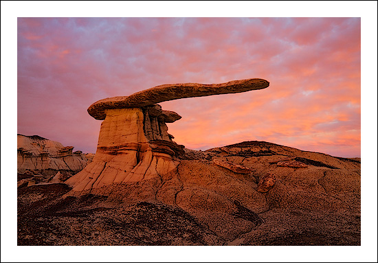
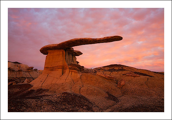
A recent image had three areas where luminosity painting was used to good effect. The image below shows the final image and includes the luminosity painting. Roll the computer mouse over the image to see how it looked before luminosity painting.
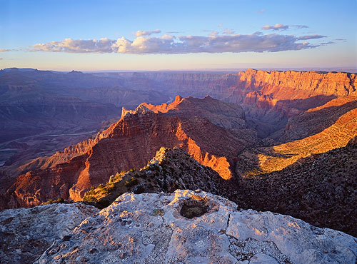
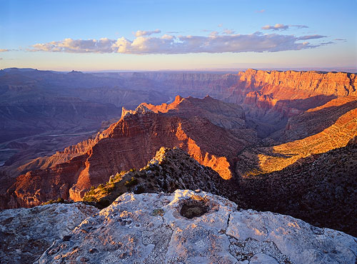
Can you see the difference? The final image (no rollover) contains three areas where luminosity painting was used to improve brightness and contrast:
- The sunlit edge near the center of the foreground rim was burned darker (rollover is too light),
- The large shadow area on the right just below the rim was lightened and the details in the shadows were enhanced (rollover is too dark and lacking detail), and
- The cloud was made darker and has more contrast (rollover is lighter with less contrast).
The process for luminosity painting is as follows:
- Create a Burn/Dodge layer.
- Create the desired luminosity mask selection. The Luminosity Masks tutorial explains how to do this. It's often useful to make selections of several similar masks and save them on the Channels palette in order to experiment with which works best.
- Type Ctrl+H to hide the marching ants that define the selection. Hiding the marching ants makes it easier to see what's happening as painting occurs on the Burn/Dodge layer. It's important to understand that after typing Ctrl+H the selection is still active and is controlling how much paint gets applied to each pixel.
- Paint the appropriate color (black to burn, white to dodge) onto the Burn/Dodge layer until the desired level of brightness and contrast is achieved. The opacity of the brush may need to be set considerably higher than what is needed for regular burning and dodging. All luminosity selections will block the paint from being deposited on the Burn/Dodge layer to some degree. Higher opacity settings for the brush are often needed to force enough paint through the selection to have the desired effect. A stroke or two of the brush will provide quick visual feedback for adjusting the brush's opacity. Don't forget that it's best to build the effect gradually with multiple strokes instead of trying to paint in the effect in just one pass and be sure to use a feathered brush.
- Deselect (Ctrl+D). The absence of the marching ants can make it easy to forget that there is an active selection. After painting, deselecting turns off the hidden selection so that it won't influence subsequent steps in the workflow of the image.
A closer look at the parts of the image painted will help illustrate how the process better.
Darkening Highlights
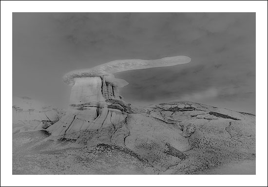
The figure below shows the area of the rim before and after it was luminosity painted. Brightness and contrast of the lighter areas were pulled down, but the mid-tone and darker values are barely affected.
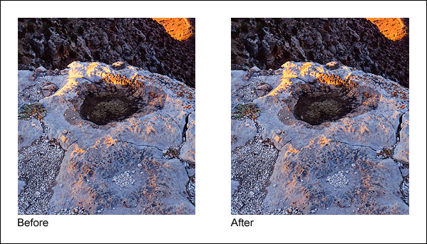
To achieve this, black paint was applied to a Burn/Dodge layer through a Light Lights (Lights-2) selection at first, but when this was seen to be also darkening the mid-tones too much, a Bright Lights (Lights-3) selection was used instead. The figure below shows the Bright Lights (Lights-3) selection that was painted through and what the Burn/Dodge layer looks like after painting on it with black paint.
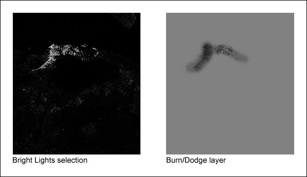
What's immediately noticeable here is that the tonal pattern of the rock is clearly visible on the Burn/Dodge layer. That's because the black paint was applied through a luminosity mask selection, and the mask itself is based on the tones in the print. The Light Lights (Lights-2) and Bright Lights (Lights-3) masks were the selections that were painted through. These selections, especially the Bright Lights (Lights-3, only show the lightest tones; dark tones are very dark or black. When black paint is applied through the Bright Lights (Lights-3) selection, only the light areas allow paint to be deposited on the Burn/Dodge layer; the black areas block it. Black darkens the colors below it, so by painting black through a selection of light tones, the light tones are preferentially darkened while the dark tones are not affected. The end result is that the too-bright highlight is nicely toned down while the surrounding darker rocks hardly change. Brightness and contrast have been decreased simply by painting on the Burn/Dodge layer.
Opening Shadows
The shadow area on the right just below the rim is a completely different situation. Here the problem is that the area is too dark and lacking in detail. The desired remedy is to increase brightness and contrast in a controlled fashion so that there is greater detail, while at the same time preserving the blackness of the darkest elements to avoid a washed-out look that too-light shadows can have. The figure below shows the area before and after luminosity painting.
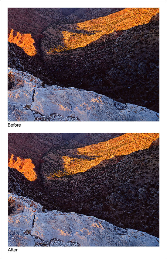
The figure below shows the selection that was painted through, in this case the Lights selection, and the resulting Burn/Dodge layer that created this effect.
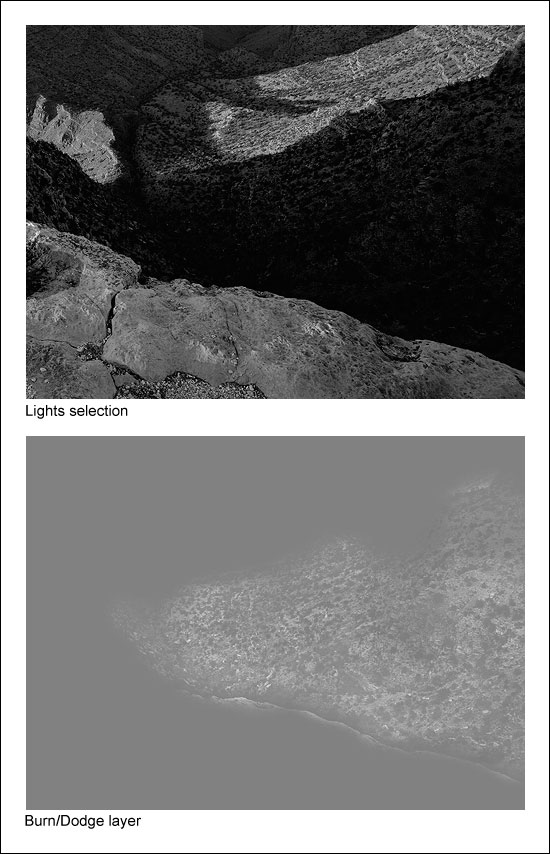
Once again, the tonal outline of the area is clearly visible on the Burn/Dodge layer. That's because white paint was applied to the layer through the Lights (Lights-1) selection. Like in the first example, painting through a luminosity selection will lay down paint in proportion to the brightness of each pixel creating an outline of the image. But since there are almost no light tones in this shadow area, it's reasonable to wonder if painting through a Lights (Lights-1) selection will have any effect on the dark tones? The answer is "Yes." Even though this area is quite dark to begin with, there is still tonal separation. The Lights (Lights-1) selection partially and properly selects the darker pixels in proportion to their level of brightness. Several passes with a high-opacity brush (75% in this case) can still force some paint to be deposited onto the Burn/Dodge layer through these weakly selected pixels. Since painting through the Lights (Lights-1) selection causes lighter pixels to get more paint, painting white into the shadows through this selection exaggerates the small degree of tonal separation that does exist. White paint on a Burn/Dodge layer dodges or lightens the colors beneath it. The gradient of white paint established by the Lights (Lights-1) selection therefore opens up the shadows quite nicely as it creates the visible "imprint" of the scene on the Burn/Dodge layer.
Painting through a Lights selection probably seems counterintuitive in this case. Selecting the shadow tones that are too dark with one of the Darks-series masks (Darks, Dark Darks, Shadow Darks, Super Darks, or Ultra Darks) and then painting white through it would seem to be a more efficient strategy to lighten the dark areas. It would be easy to get lots of white paint onto the dark pixels of the Burn/Dodge layer by painting through some well-selected dark pixels. Unfortunately, while it would indeed be more efficient, it would not be effective at maintaining the desired contrast in the area that is being painted. Remember, the goal in this situation is to leave the darkest values mostly unaffected by the painting. This maintains the strength of the shadows in the image. Painting through any of the Darks-series selections, however, would do just the opposite. Because of how the Darks-series of luminosity masks is created, the darker the tone, the more it is selected. So if any of the Darks-series selections were painted through, the darkest dark tones would receive more white paint than the lighter dark tones on the Burn/Dodge layer. This causes the darkest dark tones to turn lighter faster than the lighter dark tones. So by painting white through any of the Darks-series selections, the darkest dark tones start "catching up" to the lighter dark tones in brightness. As such, the tonal separation between the darkest dark tones and the lighter dark tones effectively decreases, and so does contrast. So in order to maintain contrast—and actually increase it a little—the white paint needs to be applied through one of the Lights-series selections. The next section reviews the strategy for deciding which type of selection, Lights-series or Darks-series, to paint through.
Which Selection? Black or White Paint?
With different luminosity selections to choose from, it's always possible to find one or more that will work. The Lights (Lights-1) selection turned out to be a particularly effective choice for opening up the shadows. The very darkest values in the shadow area appear to have remained 50% gray on the Burn/Dodge layer in the figure above even when brushed with white paint several times using a 75%-opacity brush. This means they weren't lightened by the white paint and will remain unchanged in the image. This helps preserve the richness that comes from solid dark values in the shadows. The Light Lights, Bright Lights, or Super Lights (Lights-2, -3, -4, or -5) selections would NOT have been good choices to paint through since dark pixels aren't even partially selected with these selections and it would have been nearly impossible to separate the dark tones in the shadows using them.
At first it might seem a little confusing as to whether to burn or dodge and which luminosity mask selection to paint through. To help figure it out, ask two questions. Start with "Does the area need to be lightened or darkened?" This determines which paint, black or white, to choose for painting. Choose white to lighten and black to darken. The second question to ask is "Does the area need more contrast or less contrast?" If it needs more contrast, choose a luminosity selection to paint through that reveals tones of the painting color, e.g. one of the "Lights" selections if painting with white. This is what was done in the example of opening up the shadows (white paint through the Lights (Lights-1) selection increased contrast). If less contrast is need, choose a selection to paint through that conceals tones of the painting color, e.g. one of the "Lights" selections if painting with black. This is what was done in the example of darkening the highlights (black paint through the Bright Lights (Lights-3) selection decreased contrast). The table below summarizes the different combinations, but after working it out a couple of times with actual images, the right combo is quickly obvious.
| If you want to . . . | And . . . | Paint . . . | Through a . . . |
|---|---|---|---|
| Increase brightness | Increase contrast | White | "Lights" selection1 |
| Increase brightness | Decrease contrast | White | "Darks" selection2 |
| Decrease brightness | Increase contrast | Black | "Darks" selection2 |
| Decrease brightness | Decrease contrast | Black | "Lights" selection1 |
1"Lights" selections –Lights, Light Lights, Bright Lights, Super Lights, and Ultra Lights (or Lights-1, -2, -3, -4, -5)
2"Darks" selections – Darks, Dark Darks, Shadow Darks, Super Darks, and Ultra Darks (or Darks-1, -2, -3, -4, -5)
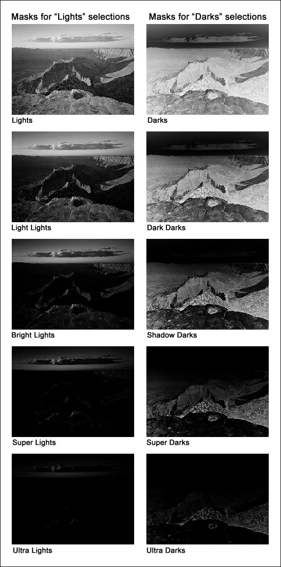
The figure below shows what the masks of the various selections look like in order to give an idea of how painting through a particular mask will deposit paint on the Burn/Dodge layer. The lighter the area on the mask, the more paint that will be deposited on the layer. Again, the Luminosity Masks tutorial explains how to make these different masks.
Another Example
When the tutorial was written, I was only using luminosity painting to affect discrete areas of the image. Since then I’ve practiced using it more broadly. Painting is a great way to touch up small areas, but much larger regions can also brushed to good effect. The standard luminosity masks created by the actions are a good starting point for choosing a mask to paint through, but there are many ways to create and combine masks. I have found zone masks to be particularly useful in luminosity painting. The bottom line is that it’s usually possible to tailor a mask that works well for a particular paint job. So while small, targeted adjustments are a good way to understand how luminosity painting works, there is a lot of room to grow and develop from there. Larger brushes, alternate masks, and the whole canvas are possibilities that should be considered.
In the Painting HDR tutorial, I liken painting through a luminosity mask to having a magic brush: one that can’t accidently paint outside the lines because it creates the lines while it paints. This applies to luminosity painting as well. Choose or create the right luminosity selection and only the pixels that need adjustment get painted on the Burn/Dodge layer; those that don’t need adjustment are unaffected. And there’s even some flexibility in the actual mask choice. Because luminosity painting can be applied heavily, lightly, or anywhere in between, even if the chosen mask isn’t the perfect one, adjusting how much paint is applied and where it's applied can overcome an imperfect mask choice to a certain degree. However, it’s always best to try and find a mask that best selects the pixels that need adjustment.
Another positive point for luminosity painting is that straight luminosity masks when used as layer masks, while very powerful, are also somewhat static. The selected pixels are defined by a mask that doesn't change (unless it is painted). True, there are an infinite number of possible luminosity masks, but each defines a specific set of pixels and percentages of pixels. Luminosity painting makes luminosity masks much more dynamic. Since the mask is simply a template for how paint is applied to the Burn/Dodge layer, the pixels and pixel percentages defined by it are only the starting point for how the mask will affect the image. Painting more or painting less through this mask template can respectively expand or contract a particular mask’s effect, so the painter/photographer has complete control to perfectly tailor how the image is affected by the selected pixels. This capability takes luminosity painting well beyond what can be accomplished with a static mask on say a Curves adjustment layer.
A recent image shows how luminosity painting was used to a greater degree than in the examples in the tutorial. Below is final image that was substantially finished using luminosity painting. Painting was used to adjust contrast and brightness to better balance the light throughout the image. The rollover shows the image without the painting, where global contrast is too high and the local contrast is too weak.
The image below shows what the Burn/Dodge layer looked like for this image after it was luminosity painted. Remember, everything lighter than 50% gray lightens the tone in the image, and everything darker than 50% gray darkens it. In general, the effect of the painting in this case was to darken some tones in the sky and to lighten and improve contrast in the land and the rock formation. The ability to affect contrast is a hallmark of luminosity painting. This can best be seen in this image in the land, pedestal, and rock formation. Luminosity painting was used to lightened the lighter tones and darken the darker tones creating better separation (more contrast) throughout these areas.
Since luminosity painting was used extensively here, it’s easy to see the imprint of the image on the Burn/Dodge layer. This is the result of painting white and black through specific luminosity masks that lighten or darken the image. The fact that the image is so plainly visible indicates how effective luminosity painting is at targeting specific tones (the magic brush effect). If luminosity masks were not used to paint through, the result would simply be light and dark splotches on the Burn/Dodge layer. The brush would distinguish no texture, and all the painted pixels would be affected equally by the paint. Luminosity painting, however, paints each pixel to perfectly match its degree of selection in the luminosity mask, so a very detailed Burn/Dodge layer results and precise brightness and contrast adjustments are possible.
One of the nice things about Luminosity painting is that it’s very easy to control, even with a computer mouse, so learning the technique isn’t all that hard. Even though my first attempts at luminosity painting were somewhat tentative, it’s clearer now how to better use it to control light throughout the image. Adjustments that used to require a Curves adjustment layer with a luminosity layer mask are now painted onto the Burn/Dodge layer with greater precision. Luminosity painting places the adjustment exactly where it’s needed (by where I choose to paint), and scales the luminosity mask’s effect with surprising accuracy (by how much paint I apply through the luminosity mask selection). While luminosity masks and Curves adjustment layers are still routinely used to affect more global or more significant tonal adjustments, when it comes to fine-tuning the image and personalizing the light, luminosity painting is my technique of choice. I hope you will give it a try.