Saturation Painting Example
The steps for saturation painting are as follows:
- Create the Saturation and Vibrance masks on the Channels palette/panel. If using my action set, there is an action that will do this.
- Create the saturation-painting layer at the top of the layer stack. Use the downloadable action in the Special Layer/Special Color section to do this.
- Choose the appropriate mask (as described in the table in the previous section) to paint through to either decrease or increase saturation and load it as a selection from the Channels palette/panel. To load a mask as a selection, Ctrl+click (Mac: Cmd+click) on the mask. Marching ants will appear enclosing pixels that are at least 50% selected.
- Hide the marching ants. Type Ctrl+H (Mac: Cmd+H). Hiding the ants doesn't stop the selection from controlling where paint is applied to the layer. It simply makes the ants invisible so that they don't interfere with visually deciding how much paint to apply and where to apply it.
- Make sure the foreground color is correct for painting. Use red for increasing saturation and gray for decreasing it. Type "X" to flip the foreground and background colors.
- Choose an appropriately sized brush for painting. The left bracket ( [ ) will decrease brush size and the right bracket ( ] ) will increase it.
- Feather the brush. Usually 50% or less hardness is appropriate.
- Set brush opacity to 5% or less. This is very important. Painting with red or gray at 100% opacity will always take the saturation adjustment way too far. Even 5% can be too much sometimes, but it's a reasonable place to start. If the effect is too strong, undo the brush stroke and lower the brush's opacity.
- Paint the appropriate areas to achieve the desired increase or decrease in saturation. The active selection (Saturation mask or Vibrance mask) will automatically restrict the paint to the proper pixels that need adjustment. Multiple brush strokes can be applied over the same area to enhance the effect.
- Once satisfied with the adjustment, turn off the hidden selection. Type Ctrl+D (Mac: Cmd+D).
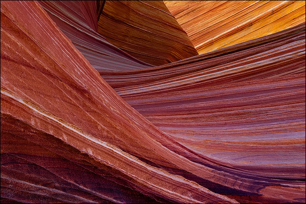
To better visualize how saturation painting works, the saturation painting for the image in the first section will be examined in greater detail. Figure 3 is once again the final image after saturation painting and the rollover is the image with the saturation-painting layer turned off.
Figure 3

|
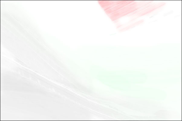
There are parts of this image where saturation has been increased substantially, parts where it has been increased slightly, and parts where saturation has been decreased. The saturation-painting layer (Figure 4) helps to understand how these changes were accomplished.
Figure 4

|
One thing about this "picture" of the saturation-painting layer needs to be mentioned—this is not exactly what your saturation-painting layers will look like. The saturation-painting layer is normally a mostly transparent layer where color is painted to either increase or decrease saturation, and the amount of paint needed to affect saturation can be so small that it's sometimes practically invisible. So Figure 4 is really just an illustration of a saturation-painting layer. It was made by changing the blending mode of the saturation-painting layer from Saturation to Normal and then merging this layer down to a layer below that was filled with white. This makes the painted areas and the painted colors visible in order to illustrate how this layer works.
As you look at this layer you can see red, green, and gray. The red and green are saturated colors. I used some green (RGB=0,255,0) here as an experiment to prove that other 100% saturated colors besides red (RGB=255,0,0) also do the job of increasing saturation. (They do!) So the red and the green areas in Figure 4 correspond to areas in the image where saturation was increased by saturation painting. The heaviest red area in the upper right is where several brush strokes were applied to make the substantial increase in saturation in the yellow trapezoid. As the Saturation blending mode is meant to do, it transferred the red's saturation to the image without affecting the hue or brightness of the underlying colors. Only the saturation of these colors changed. The same thing is occurring in the green-painted areas, but here the effect is less pronounced since not nearly as much paint was applied. The areas painted green simply didn't need the degree of saturation boost that the red-painted area needed, so less paint was applied to produce the effect. Comparing Figure 3 with its rollover helps understand the different degrees of saturation change that are possible from applying different amounts of paint.
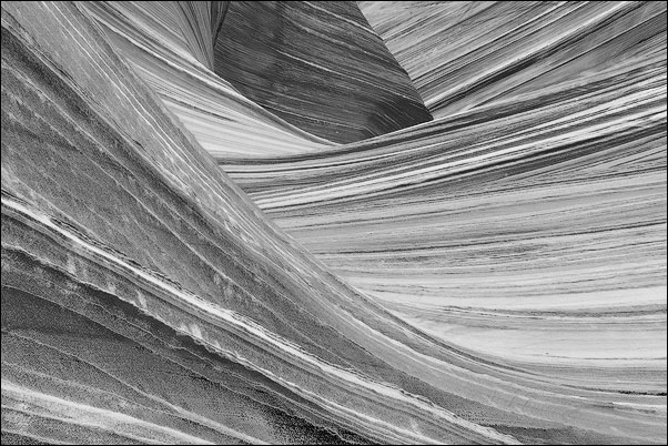
It's important to notice as you look at the red areas in the image, and to a lesser extent the green areas (because they're so light), that you can see the outline of the image itself. This is because the paint was applied through a selection of the image's Vibrance mask, and that mask controlled which pixels received paint and how much. Remember, the Vibrance mask is a graphical representation of the less saturated colors in the image. The lower the pixel's degree of saturation, the whiter the pixel will be in the mask. So in a mask of the image's vibrance, the least saturated pixels are the whitest and most saturated pixels the blackest. Because the mask is created from the actual pixels in the image, the range of vibrance is depicted as various shades of gray. Figure 5 shows the Vibrance mask for this image.
Figure 5

|
A lot of image detail is visible in the mask. This is because the different colors in the mask have different degrees of saturation, and the mask separates these different saturation levels into gray tones. As paint is applied through a selection of the mask, lighter tones in the mask receive more paint and darker tones less paint. This distributes paint on the saturation-painting layer in a manner that mimics the lighter pixels in the mask. Lighter pixels receive more paint and darker pixels receive less so the image texture is in this way transferred the saturation-painting layer.
For saturation painting, this mimicry means that pixels receive paint according to how much paint they need. When painting with red and green, the goal is to intensify the saturation of weakly saturated colors. Painting through a selection of the Vibrance mask not only ensures that the low-saturation colors will be intensified, but the lower the color saturation, the more paint the pixel receives and the greater the intensification. At the same time, since saturated colors are darker in the Vibrance mask, they receive less paint, and therefore won't have their saturation increased as much. This then helps solve the problem of accidentally over-saturating already saturated colors. Painting through a Vibrance mask selection naturally directs paint away from the already saturated colors. So to repeat, pixels receive paint according to how much paint they need. The mask is what makes this happen. Painting through the Vibrance mask selection is an ideal way to intensify the saturation of weakly-saturated colors while at the same tempering an increase in saturation of the more-saturated colors. And, as is the characteristic of all these pixel-based masks, the gradation of tones in the mask insures that painting through the selection distributes the paint just right to make the saturation change blend well with the rest of the image.
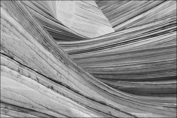
Increasing saturation by painting saturated color onto the saturation-painting layer is only half of what's going with this layer. The gray tones in Figure 4 are having the opposite effect, i.e. they are decreasing saturation in the colors that they cover. In order to better target the saturation tones with gray paint, the Saturation mask was loaded as a selection before painting. Figure 6 shows the Saturation mask for this image.
Figure 6

|
This mask is a black and white representation of color saturation in the image. The more-saturated the color, the lighter the tone in the mask and the less-saturated the color, the darker the tone. When this mask is loaded as a selection, the lighter, more-saturated pixels have a higher degree of selection than the darker, less-saturated pixels. Painting through this selection, therefore, deposits more paint on the more-saturated pixels. So by painting the color gray (saturation=zero) through this selection of saturated colors onto the saturation-painting layer, the saturation of over-saturated colors is decreased more than the saturation of less-saturated colors. The Saturation mask selection targets the paint to the pixels most in need of desaturation and then blends the adjustment into the surrounding pixels. Looking at the gray areas in Figure 4 it can be seen how the gray paint has been distributed by the Saturation mask selection to fall more heavily on the most saturated colors, i.e. the lightest parts of the Saturation mask. This is exactly what is needed to help lower the saturation of some of the more saturated colors in this image while sparing the less-saturated colors from getting less saturated.
| Introduction |
| Special Layer/Special Colors |
| PREVIOUS—Incorporating the Masks |
| YOU ARE HERE—Saturation Painting Example |
| NEXT—Summary |