Darkening Highlights
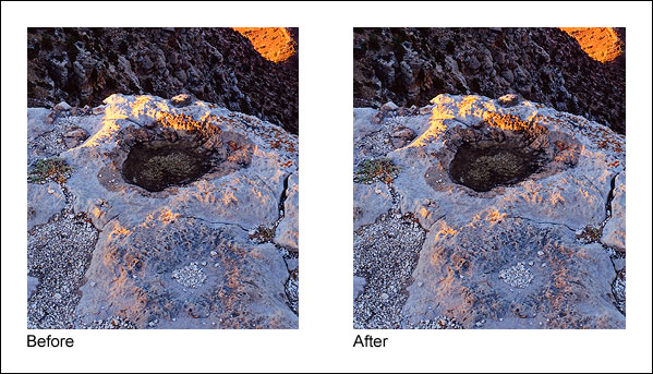
Figure 9 shows the area of the rim before and after it was luminosity painted. Brightness and contrast of the lighter areas were pulled down, but the mid-tone and darker values are barely affected.
Figure 9
|
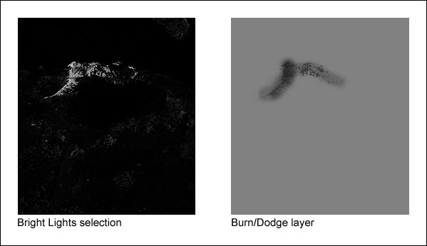
To achieve this, black paint was applied to a Burn/Dodge layer through a Light Lights selection at first, but when this was seen to be also darkening the mid-tones too much, a Bright Lights selection was used instead. Figure 10 shows the Bright Lights selection that was painted through and what the Burn/Dodge layer looks like after painting on it with black paint.
Figure 10
|
What's immediately noticeable here is that the tonal pattern of the rock is clearly visible on the Burn/Dodge layer. That's because the black paint was applied through a luminosity mask selection, and the mask itself is based on the tones in the print. The Light Lights and Bright Lights masks were the selections that were painted through. These selections, especially the Bright Lights, only show the lightest tones; dark tones are very dark or black. When black paint is applied through the Bright Lights selection, only the light areas allow paint to be deposited on the Burn/Dodge layer; the black areas block it. Black darkens the colors below it, so by painting black through a selection of light tones, the light tones are preferentially darkened while the dark tones are not affected. The end result is that the too-bright highlight is nicely toned down while the surrounding darker rocks hardly change. Brightness and contrast have been decreased simply by painting on the Burn/Dodge layer.