Saturation Masks
©2018 Tony Kuyper
QUESTION: What are saturation masks?
ANSWER: Saturation masks in Photoshop specifically target saturated tones in the image. They are essentially a gray-scale map of pixel-level saturation values. Highly saturated colors are white or very light in the mask and unsaturated colors are black or dark gray. These masks provide a convenient method to balance saturation across the image.
(NOTE: The video at the bottom also covers much of the information found in this tutorial.)
Saturation masks are very much like luminosity masks. But instead of mapping image luminance at the pixel level, saturation masks map saturation. And whereas luminosity masks are generally used for adjusting or painting brightness and contrast into an image, saturation masks are used to balance and paint saturation. Saturation is one of three main elements (brightness/contrast, hue/color, and saturation) that need to be addressed during image processing, but because it's relatively difficult to accurately target saturation, it's often overlooked or only addressed broadly using things like Hue/Saturation or Vibrance adjustment layers. Saturation masks change all that. With these masks, it's easy to make masks and selections that target specifically the most saturated or unsaturated tones in the image. It's even possible to make saturation "zone" masks. Once these are available, photographers can approach saturation with confidence knowing these precision masks can target just those parts of the image they want to adjust. To see what a saturation mask looks like, rollover the image below.
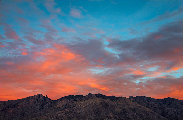
My initial efforts to make saturation masks involved using Photoshop's HSB/HSL filter, but I quickly saw that this filter made inaccurate saturation masks as discussed in this blog post. The video below also shows why the HSB/HSL filter is a bad choice for saturation masks. That was nearly a decade ago, and I abandoned HSB/HSL once I found a better way for making what I term "true" saturation masks. These true saturation masks are perfectly feathered for all colors in the image at all brightness levels. Once they were available, a whole new world of saturation adjustment quickly opened. This tutorial describes the method for making these true saturation masks, and their vibrance mask counterparts. It also describes the two best techniques for using them to balance saturation across the image.
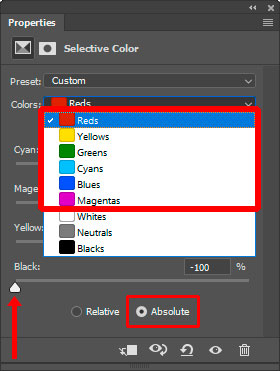
True saturation masks are actually quite easy to make, though the method is not entirely obvious. Start with a Selective Color adjustment layer and set the color change to "Absolute" in order to make sure the necessary adjustments are independent of the amount of color actually present in each pixel. Then for all the colors in the "Colors:" drop-down menu (Reds, Yellows, Greens, Cyans, Blues, Magentas), move the "Blacks" slider all the way left to -100%.
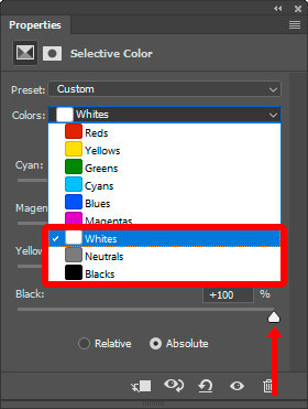
For all the non-colors in the "Colors" drop-down menu (Whites, Neutrals, Blacks), move the "Blacks" slider all the way right to +100%.
With this adjustment in place, the composite image now shows what a true saturation mask looks like. To make an actual mask of it, simply duplicate any of the color channels on the Channels panel since they're all identical at this point. Once it's available on the Channels panel, the Selective Color adjustment layer used to create it can be deleted. The duplicate channel is a true 16-bit saturation mask. This same process is also carried out in the background when the TK7 panel creates a saturation mask.
Below is the true saturation mask for the image. In a saturation mask, completely saturated colors (100% saturation) should be white. Completely unsaturated colors should be black, and colors in between should be intermediate shades of gray that correspond to their degree of saturation. Rolling over the mask shows the original image. It's easy to see that this true saturation mask got it right. The orange clouds in the image are very light in the mask indicating a high degree of saturated color. The gray clouds are nearly black in the mask indicating that their color is very unsaturated, which is also correct. Intermediate colors, like the blue sky at the top, are an intermediate shade of gray. Again, this is exactly as expected. Finally, dark colors, like the mountains, are also dark in the mask indicating they do not contain saturated colors.
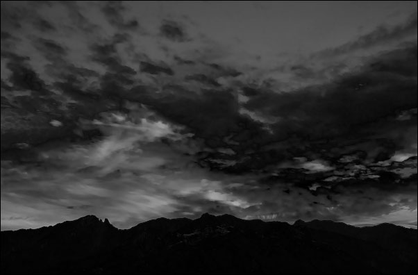
Notice the smooth transitions from saturated to unsaturated colors in the mask. There are no hard edges like with Adobe's selection tools. This is the result of these masks being built from pixel-level data. In the mask, every pixel is perfectly mapped to match its degree of saturation in the image. From a practical standpoint, this means that any adjustment through these masks (or painting through the corresponding selection) will be completely self-feathering. The mask corresponds to the image pixel-for-pixel, and this insures that anything controlled by the mask will also perfectly align and perfectly blend into the overall image.
Just like there are two main types of luminosity masks, lights and darks, there are also two types of saturation masks: saturation and vibrance. And, again, just like with luminosity masks, they are the inverse of each. Inverting a saturation mask creates the vibrance mask.
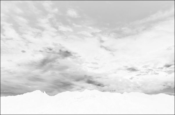
Armed with these two types of saturation masks that accurately reflect true saturation in the image, it's quite easy to become a saturation ninja, expertly controlling image saturation to your liking. There are just two main techniques to master: 1) saturation painting and 2) vibrance masks as a layer masks on a Hue/Saturation adjustment layer. However, knowing which technique to use is important. Both options are explained below.
SITUATION #1: OVER-saturation
TECHNIQUE TO USE: Saturation painting
RATIONALE: Usually there are just isolated areas of over-saturation in an image, often as a result of aggressive processing. Rather than making a global saturation change to correct this, it's often easier and more precise to simply paint it away with saturation painting. This is the equivalent of dodging using luminosity painting and is described in this tutorial.
HOW TO DO IT:
- Create a blank pixel layer set to Saturation blend mode. This is the saturation painting layer.
- Create a true saturation mask and load it as a selection.
- Select the brush tool and set the foreground color to gray and the opacity of 5 to 10%.
- Paint through the active selection on the over-saturated parts of the image. The active selection of the true saturation mask will restrict the paint to landing on just the most saturated areas of the image.
- Add additional brushstrokes until the desired level of saturation is achieved.
WHY IT WORKS: Saturation blend mode combines the saturation of the saturation painting layer with the hue and luminosity of the underlying layers. Gray paint has a saturation of 0%. So if gray paint is painted on the saturation painting layer at 100% opacity, the result would be that the underlying color would now be 0% saturated. In other words, all color would be removed. Painting with a brush opacity of 5 to 10% means that the underlying color's saturation will be decreased proportionally. Saturation painting with a low opacity brush and multiple brush strokes provides a very controlled method for lowering the saturation of over-saturated parts of the image defined by the active saturation mask selection.
SITUATION #2: UNDER-saturation
TECHNIQUE TO USE: Use a Hue/Saturation adjustment layer with a vibrance mask as the layer mask.
RATIONALE: Under-saturation in an image is often more global. The image simply looks dull when it doesn't have enough color. While additional saturation could be painted in with saturation painting (by painting with red instead of gray through a vibrance mask), large parts of most images can usually benefit from a global increase in saturation as long it's restricted to less saturated colors, which is exactly what a vibrance mask does. So it's often better to do a global adjustment with an adjustment layer rather than a precision adjustment with a paintbrush.
HOW TO DO IT:
- Create a true vibrance mask. The initial vibrance mask will usually be too revealing, so narrow the range with a Levels adjustment to the mask. I like using a Zone 8-½ or Zone 9 vibrance mask as my starting point for enhancing under-saturated colors.
- Create a Hue/Saturation adjustment layer with the chosen vibrance mask as the layer mask.
- Open the Hue/Saturation properties and drag the saturation slider to the right to achieve the desired degree of saturation across the image.
WHY IT WORKS: The vibrance layer mask insures that the adjustment only targets the less saturated tones in the image. More saturated colors will NOT receive the adjustment so they won't over-saturate with this process. The saturation boost only affects dull colors in the image because the vibrance mask controls which pixels are affected.
SUMMARY: True saturation masks are easy to create with a Selective Color adjustment layer. Once the initial saturation mask is created, it can be inverted to create a vibrance mask. There are two main methods for balancing image saturation.
- Saturation painting through a saturation mask is a precision method for addressing oversaturation of specific elements in an image.
- A Hue/Saturation adjustment through a vibrance mask is a great way to bring additional saturation to under-saturated tones while sparing more-saturate colors from the adjustment.
Saturation changes to an image can be subtle, but I usually experiment with both techniques when the image is nearing completion. It's often surprising how specifically addressing saturation in this manner can improve the image.
The video below reviews and demonstrates the information in this tutorial.
